


Paris and Île-de-France LGBTQI+ Center
Revamp Showcase Website for Improved UX and UI on Desktop and Mobile.
portfolio pdf

The problem:
How might we design the website to best emulate the warm and inclusive welcome experience of the physical center while being easy to navigate and accessible to all, including those who are discovering the center for the first time?
THE PROJECT
-
The context: the LGBTQI+ Center of Paris and Île-de-France plays a crucial role in the LGBTQI+ community by offering various services and promoting rights, equality, and social inclusion.
-
The website: the website serves as an essential digital showcase for the LGBTQI+ Center of Paris, presenting its activities, resources, and affiliated associations to LGBTQI+ individuals.
-
Target audience: LGBTQI+ individuals seeking information for the first time.
-
Client's needs:
-
The client desires an informative, intuitive, and welcoming website that simulates the Center's in-person experience, targeting a diverse audience.
-
The objective is to present the Center, its missions, resources clearly, and simplify donation and membership processes.
-
The client aims to attract a younger audience, modernize the Center's image, and address overall image issues.
-
Emphasis is placed on streamlining content for clear navigation, highlighting resources, and assisting individuals.
-
-
The goals:
-
The goals are to validate the client's needs and create an informative, inclusive, and engaging online space that supports the LGBTQ community's needs, rights, and awareness, while providing a positive experience for all users, simulating the welcoming atmosphere of the in-person Center. Additionally, it is crucial to increase the number of online visitors, as currently, the website only attracts 10% of the potential online audience. Once these needs are validated, we will proceed with the website design.
-
THE APPROACH
-
Context: in this case study, we address the redesign of the LGBTQI+ Center of Paris and Île-de-France website. Despite the absence of direct user input due to budget and time constraints, we took on the challenge by using other data sources and user-centered design methods to enhance the online experience while reflecting the Center's mission and values.
-
Research:
-
Identify client's needs and target audience (Speedboat methodology).
-
Identify specifics related to LGBT-inclusive design.
-
Identify areas of improvement in the current website (Audit).
-
Define objectives.
-
Affirm the new site and its features (Card Voting methodology).
-
Align needs, objectives, and features.
-
Competitive comparative study.
-
Problem to solve.
-
Value proposition.
-
-
Design & Testing
-
Design the new site structure.
-
Designing mid-fi wireframes.
-
Research design trends and stylistic approaches for an LGBT website.
-
Analyze competitors' designs.
-
Moodboard.
-
UI Kit.
-
Hi-fi wireframe.
-
User testing.
-
Responsiveness.
-
-
The Conclusion & The Next steps
THE PROJECT SETUP
-
Project duration: 4 month, 2023.
-
Team: 3 UX/UI Designer.
-
Deliverables: Webflow website and wireframes.
-
Tools: Figma, Figjam, Notion, Slack, Google Workspaces, Webflow.
-
My role: UX/UI Designer responsible for developing and implementing user research and user experience strategy. Additionally, contributed to the UI development for the project.
PROJECT STRATEGY
STRATEGY BLUEPRINT
Before fully jumping into the Design Thinking methodology, we begin by establishing a Project Strategy through the use of the User experience (UX) Strategy Blueprint.

(Strategy Blueprint)
RESEARCH
Research Strategy
The Goal: to identify the client's needs, the target audience, the specificities related to LGBTQI+ inclusive design, website issues, establish goals and functionalities, and analyze competitors.
IDENTIFY CLIENT NEEDS
The Goal: understand the product, identify client needs, determine various factors affecting the project.

(Speedboat methodology)
-
Methodology: Speedboat.
-
The client Insights
-
Informative virtual welcome.
-
Clear center presentation.
-
Resource showcase.
-
Events calendar.
-
Streamlined donations and memberships.
-
Central hub for activities.
-
Attract younger audience.
-
Improved image and values representation.
-
Simplified content.
-
Enhanced individual assistance highlight.
-
The Quotes:
-
"If someone comes to the Centre, it's because they want to talk, they want information, they want to be able to have a dialogue with volunteers to ask questions in real-time. The website is supposed to address this, which means when people enter the website, the resources that are within the Centre should be accessible through the website, as well as highlighting our events and website resources."
-
"The homepage mainly shows the agenda, which is good; it demonstrates activity. But then, the information goes to another level."
IDENTIFY TARGET AUDIENCE
The Goal: identify the project's target audience.
-
Methodology: analyze the Center's activity reports to understand the current audience and define the target audience.
ANALYSIS RESULTS
-
More than half of the visitors are regular attendees of the Center.
-
Approximately 10% of visitors are not regulars and require specific information.
-
The Quotes: "I think the fact that only 10% come to ask for information is more due to the fact that we have very little emphasis on our information rather than having few people coming for that."
The Conclusion: the client has identified the target persona as individuals seeking information for the first time. The client will focus on this segment of new LGBTQI+ users to simulate the in-person welcoming experience of the Center by highlighting all available information and resources on the website.
*Annotation:
- Due to the audience's diversity, no specific personas are created.
-
The focus is on unfamiliar visitors (10%).
-
An LGBTQI+-inclusive approach.
-
Aligned with the client's objectives.
UNDERSTANDING SPECIFICITIES RELATED TO INCLUSIVE LGBTQI+ DESIGN
The Goal: gain a better understanding of our LGBTQI+ audience and design accordingly. Explore best practices, specific needs, and visual elements that promote authenticity and acceptance.

-
Methodology: research on inclusive design for the LGBTQI+ audience.
-
Measures to address the needs of the LGBTQI+ community:
-
Inclusive visuals with community input.
-
Highlight resources and events.
-
Use respectful language.
-
Customize gender identity options.
-
Offer educational content.
-
Incorporate LGBTQI+ symbols.
-
Share community info and events.
-
IDENTIFYING AREAS FOR IMPROVEMENT ON THE CURRENT WEBSITE
The Goal: gain a detailed understanding of the current state of the website, identifying strengths to retain and areas requiring improvement.

(Former website)
-
Methodology: Nielsen's heuristics.
-
Results:
- Information architecture problems
-
Clarity of communication with the user
-
Design consistency
-
Error prevention
-
These elements are crucial for improving the user experience.
The Conclusion: the findings of the audit play a pivotal role in shaping our design and development strategies. They serve as a compass, ensuring that our efforts remain closely aligned with the client's specific requirements and adhere to inclusive LGBTQI+ design principles. These insights not only inform our approach but also hold the promise of significantly enhancing the overall user experience, catering to the needs of both the new targeted audience and our regular visitors. This commitment to a user-centric and inclusive design philosophy is at the core of our mission as we move forward with the website's evolution.
DEFINING OBJECTIVES AND FUNCTIONALITIES - ALIGNMENT OF NEEDS, OBJECTIVES AND FUNCTIONALITIES
The Goal: to define specific objectives for each need, thereby guiding the project and specifying the necessary functionalities. Grouped associated needs, objectives, and functionalities.
-
Methodology: Card Voting.

(List of associated needs, objectives, and functionalities.)
BUSINESS & COMPETITORS ANALYSIS
DIRECT & INDIRECT
The Goal: explore the market, study best practices, gather innovative ideas, and evaluate their relevance to our objectives and functionalities.
-
Methodology:
-
Comparative study of direct and indirect competitors, nationally and internationally.
-
In-depth analysis of competitors' homepage.
-
Examination of several key elements to understand their strategy and effectiveness.
-
The Conclusion - Observations on competitor websites: upon analyzing competitor websites, several key takeaways have emerged. Firstly, the 'About Us' section is consistently featured and should be added to our site. Additionally, a presentation section on the homepage, the promotion of events and resources, and the inclusion of social media links and a search bar are recommended practices to adopt. Special attention should be given to optimizing call-to-action buttons, navigation, and menu structure. Finally, our website has the opportunity to distinguish itself through a unique design.
PROBLEM TO SOLVE
CLIENT
Our client aims to expand its impact by attracting approximately 10% of individuals who are not familiar with the center. The objective is to create a website that mirrors the physical welcoming experience of the center by providing all the information and resources available in person online. To achieve this, we must address issues related to navigation, accessibility, information clarity, user engagement, and the faithful representation of the center's services. By addressing these areas, the website will become as welcoming, informative, and accessible as the center itself, thereby extending its reach to a broader audience.
VALUE PROPOSITION
With our redesign of the Paris and Île-de-France LGBTQI+ Center website, we aim to:
In general:
-
Replicate online the warm and inclusive welcome of the physical Center, making the site easy to navigate and accessible to everyone, including those discovering the Center for the first time.
-
Centralize key information and resources for the LGBTQI+ community, including activities, services of affiliated associations, and information on rights and social inclusion.
Concretely:
-
Improve access to information through a dedicated category on the site, offering a virtual welcoming experience similar to the physical Center for LGBTQI+ individuals.
-
Reliably and consensually highlight the resources, missions, and values of the Center, as well as the services offered by its affiliated associations.
-
Simplify the donation and membership processes, and attract a younger audience by modernizing the Center's image and focusing on simplified navigation to highlight resources and assist individuals.
-
Provide a positive and engaging online user experience that supports the needs, rights, and awareness of the LGBTQI+ community, while promoting authentic inclusivity and visibility through respectful design and inclusive language.
CONCEPTION - DESIGN - TESTING
DESIGN STRATEGY
The Goal:
-
Address the identified needs at each stage of our research to design an effective website.
-
Adopt an inclusive design that celebrates the diversity of the LGBTQI+ community. Our approach aims to faithfully represent the values, needs, and identities of this community by promoting inclusivity, visibility, and authenticity. Our commitment lies in respecting and accepting LGBTQI+ individuals.
DESIGN OF THE NEW SITE MAP
-
Challenges faced:
-
Information organization
-
Navigation
-
Page naming
-
-
Solutions: cleaning and streamlining of information, improved navigation, simplification of page naming, creation of a clear information architecture.
-
Result: improved, user-friendly, and efficient site map, resolution of initial problems.
MID-FI WIREFRAME DESIGN: The 2 Major Challenges

(Designing mid-fi wireframes)
The 2 primary challenges:
-
Optimal placement of elements in the header, including the search bar, "Donate" and "Become a Volunteer" buttons, logo, message banner, and full navigation menu, while maintaining visual clarity and ease of navigation.
-
Designing the navigation menu to handle a large amount of resources and pages without visually overwhelming the site, using complex dropdown menus for logical organization and intuitive navigation.
RESEARCHING DESIGN TRENDS AND STYLISTIC APPROACHES FOR AN LGBT WEBSITE
.jpg)
(Design trends)
LGBT Website Design Trends:
-
Diverse colors: use bold LGBTQ+ colors for inclusivity.
-
Illustrativediversity: add subtle illustrations celebrating LGBTQ+ variety.
-
Interactive features: include animations for user engagement.
-
Maximalist cohesion: maintain consistent, non-overwhelming maximalist design.
-
Brutalist impact: create visually striking contrast with brutalist elements.
Targeted outcomes:
-
Foster emotional connection through inclusivity.
-
Encourage user engagement and action.
-
Establish website as LGBTQ+ innovation hub.
COMPETITIVE DESIGN ANALYSIS
DIRECT & INDIRECT
The Goal: identify current design trends in our sector.
-
Methodology:
-
Selection of 8 organizations, including direct and indirect competitors.
-
Analysis of visual approach, user engagement, and site attractiveness.
-
Conclusion: current trends encourage bold and meaningful use of color and imagery to drive visitor engagement. For the LGBTQI+ Center of Paris and Île-de-France, we envision a similar approach to enhance visitor engagement, focusing on captivating visual elements and intuitive navigation to enrich the user experience.
MOODBOARD PROPOSAL
The Goal: after analyzing design trends, we have proposed two moodboards, "Funky Stickers" and "Color Power," to visualize our creative directions. These moodboards represent our key themes and offer different visions of the project. Our goal is to create an emotional user experience while ensuring intuitive and engaging navigation on the website.

(Moodboard 2: “Color Power”)
(Moodboard 1: “Funky Stickers” )
Moodboard 1: “Funky Stickers”
-
Evokes youth and freedom.
-
Bright colors, funky patterns.
-
Fun, personalized design with stickers vibe.
-
Connects authentically with diverse, young audience.
Moodboard 2: “Color Power”
-
Vibrant palette celebrates color's diversity and impact.
-
Strategic hues grab attention, evoke emotion, and convey messages.
-
Bold contrasts and combinations guide user experience.
-
Harness color for engagement, differentiation, and brand expression.
-
Ideal for standing out, inspiring action, and expressing dynamism.
UI KIT
Creation of a UI Kit summarizing the graphic elements with contextual indications and objectives.

(UI KIT)
The Goal :
-
Energize the screens by recalling the friendly and positive spirit of the Center.
-
Subtle use of LGBTQIA+ flags in blurred gradients to avoid visual clutter.
-
Choice of Satoshi sans-serif typography for its simplicity, paired with a warm and modern grayscale palette.
-
Treating images like Polaroids with a sliding effect animation.
-
Expression of simplicity and clarity while adding life with occasional illustrations in important sections.
HIGH-FIDELITY WIREFRAME - RESPONSIVENESS
For the design we followed the CRAP principles ( Contracts, Repetition, Alignment, Proximity),
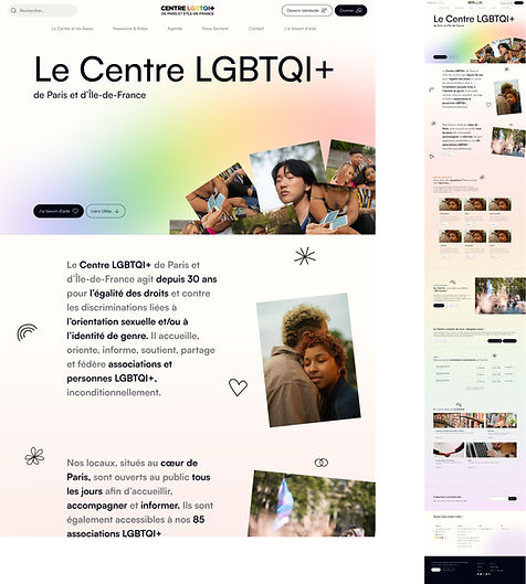
(Desktop version)
(Mobile version)
Steps:
-
Homepage with animated background based on scroll to display LGBTQIA+ flag colors.
-
Consistent page structure for easy navigation.
-
Use of "hero" sections on each page with a similar image display system for simplified reading.
-
Animations of CTAs and clickable components for a smooth look and feel, with an Ease-in-Ease-out curve for smooth transitions.
-
Simultaneous use of two graphic codes to double hover readability and improve site accessibility.
-
Wireframe to finalize site construction and address the last structural questions before user testing.
PROTOTYPE TESTING
Scenario :
-
Diverse participant recruitment for user testing.
-
Objective: Ensure diversity in age, gender identity, sexual orientation, disabilities, devices, and navigation skills.
-
Methodology: Remote testing with high-fidelity prototype, specific tasks, observation, and feedback collection.
Results:
-
Here's a summary of the main findings from our study:
-
Tasks: Successfully completed without major issues.
-
Navigation: Dropdown menu disrupted navigation.
-
Homepage: Scrolling required but had no negative impact.
-
Video in hero: Recurrent request for improved usability.
-
Access to "I Need Help": Emphasizing and making it more prominent is important.
-
Practical information: Hours and social media links need to be more accessible.
-
Partnerships: Simplify contact with direct contact details.
-
UI: Mostly positive feedback, need to balance simplicity and clarity.
-
Typography and colors: Typography appreciated, colors not vibrant enough to reflect the spirit of "pride."
Testing conclusions:
-
"Quick wins" solutions were implemented to avoid delays.
-
Moving hours and access information to the footer to improve accessibility.
-
Some suggested modifications couldn't be applied due to external factors.
-
Questioning the inclusivity of the "Youth" and "Senior" pages, but the Center's structure by department can't be changed for the current site.
THE BEFORE AND AFTER

(Before)
(After)
THE CONCLUSION
This project required a significant amount of work on sorting pages and creating a coherent navigation. The provided solution effectively addressed the initial need for information categorization. Furthermore, the UI design work helped refresh the Center's image and improve website readability. This graphic overhaul also reinforced the concept of LGBTQI+ inclusivity through visual identity.
NEXT STEPS
1. Post-redesign data analysis
-
Data Collection: Use Google Analytics to measure traffic, conversion rates, etc., after the redesign.
-
Pre vs. Post Redesign Comparison: Assess the redesign's impact on traffic and engagement.
2. Objective evaluation
-
Objective Verification: Determine if the targeted increase in traffic was achieved.
-
Gap Identification: Identify any discrepancies between expected and actual results.
3. Continuous optimization
-
Page Performance Analysis: Identify the best and worst-performing pages to understand visitor preferences.
-
UX and Content Improvement: Adjust content and user interface based on analysis.
-
A/B Testing: Implement A/B testing to validate improvements.
